Update:
Google shut down Google Video in 2012 because of its acquisition of YouTube.

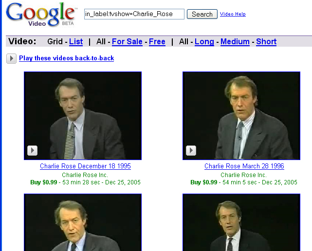
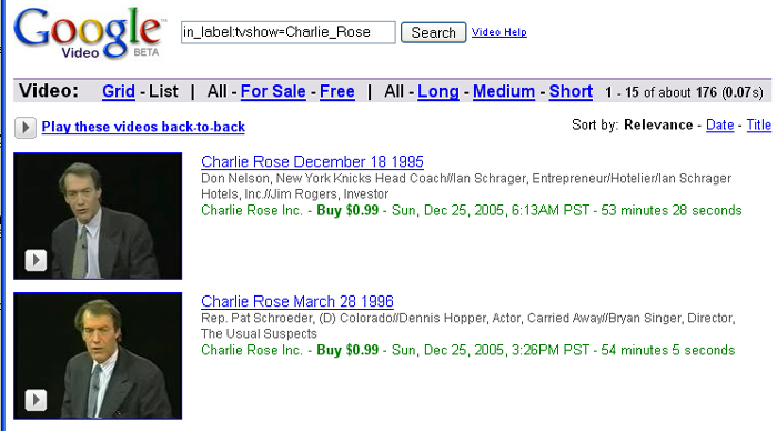
I took a quick look at Google Video and my first impression was not great. Notice on the Charlie Rose videos that there is no show topic displayed when your are in “Grid” view. You just see the date of the show and a thumbnail of Charlie Rose. You need to go to the “List” view to see a description of the show. While this is a minor issue, I would have expected Google to catch something like this before they launch the paid video service. First impressions are everything. Another thing: Notice how the upload date of the video is displayed next to the running time of the show. For these shows, the upload date appears to be Dec 25, 2005 (hmmmm, someone at Google was working on Christmas). As a consumer, I really don’t care about when the video was uploaded. On the positive side, I really like that any content provider can sell video on Google and the content provider can set the price. These capabilities are not available on iTunes yet.
More bad first impressions here.
1/19/2005 Update:
David Pogue from the New York Times takes a look at the Google Video Marketplace.
“According to Google, the current Google Video is a beta test, a dry run intended to solicit feedback and suggestions for improvement. That’s fortunate, because at the moment, the site is appallingly half-baked. Quarter-baked, in fact.”
1/26/2005 Update:
Google admits that their video service has “fallen far short” of competing services such as iTunes. More here.

Here’s the List view, which does show a description of the show.
